Coastal Flame — Brand Identity & Creative Direction
A restaurant imagined from the ground up.
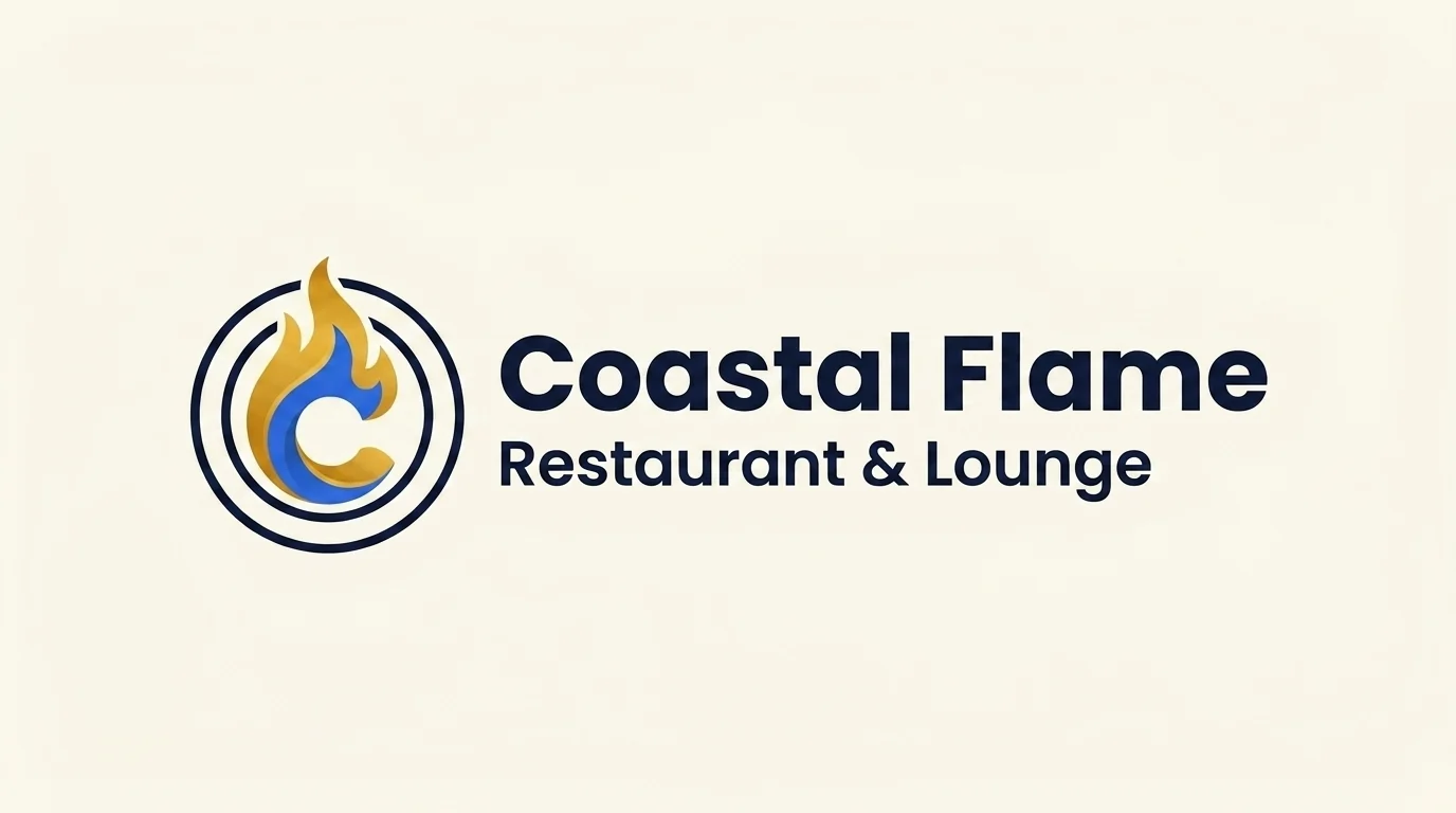 AI-assisted concept · Fictional brand
Context
A fictional restaurant and lounge concept developed with Timothy as sample work for MohTim Digital, the digital-services company we were working to build. The project was created to show potential clients a possible brand direction.
My contribution
Branding direction, AI prompting and selection of visual concepts, alongside other parts of the concept project.
The approach
I guided the branding direction and used AI image generation to explore visual ideas for the restaurant identity and its presentation. The work explores how branding could connect with a website, marketing and social-media design.
Tools & focus
Branding / UI/UX / Creative direction
A warm welcome, with a contemporary edge.
Coastal Flame Restaurant & Lounge imagines a hospitality brand for diners looking for a welcoming restaurant and lounge experience in Freetown. Developed as sample work for MohTim Digital, the concept asks how one visual language could carry from a logo to printed materials and digital promotion.
Creative strategy
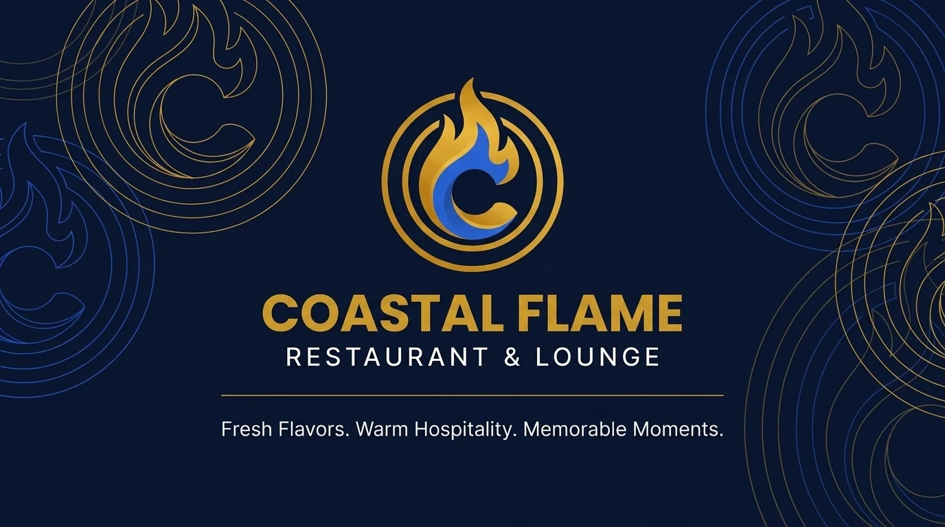
The emblem brings together a dining-plate circle, a flame and a suggested letter C. Navy provides a calm base, blue adds a contemporary note, and gold introduces warmth. Cream keeps the layouts open and gives the darker elements room to stand out.
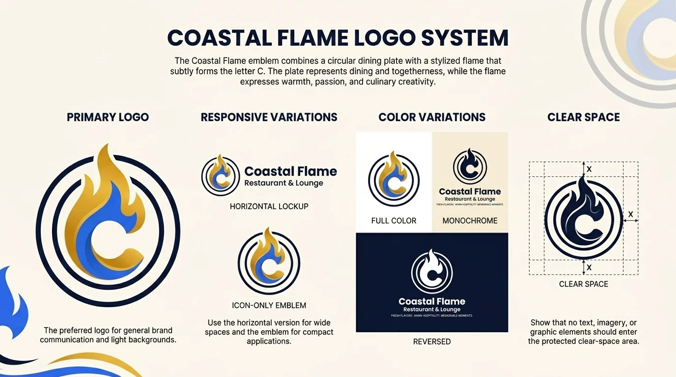
One palette, across the system
The intended palette is Deep Navy #0B132B, Royal Blue #2563EB, Warm Gold #D4A017 and Warm Cream #FDF7F0. These are the target values for a future editable identity; colors within the generated mockups can vary.
#0B132B#2563EB#D4A017#FDF7F0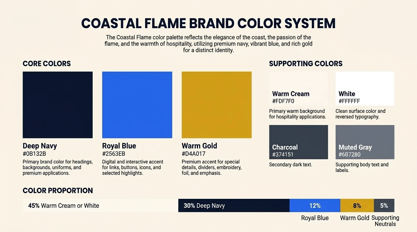
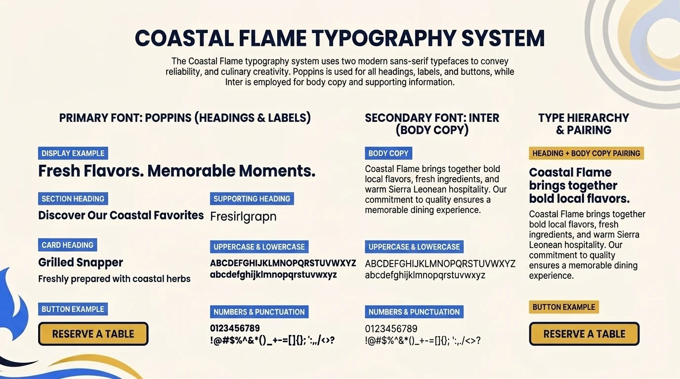
Typography with a clear hierarchy
Poppins for headings and Inter for body copy form the proposed typography direction. The goal is a confident title style paired with straightforward supporting text. The supplied image explores that hierarchy; it is not a typeset, editable brand manual.
From identity to applications
The supplied archive contains 14 images, including logo variations, presentation sheets, business-card concepts, stationery and employee-ID mockups. This selection focuses on the clearest examples. Contact-side cards, IDs and letterhead are omitted here because they contain sample contact details, portraits or QR codes.
My role and the AI-assisted workflow
I led brand direction and visual-system planning while collaborating with Timothy Kallon on the wider MohTim concept. I guided image generation with briefs and prompts, selected promising variations, refined the direction and reviewed the outputs for consistency across applications.
- Set the hospitality brief, tone and visual constraints.
- Explore the emblem, lockups and color direction through AI-generated variations.
- Compare outputs for legibility, brand consistency and useful applications.
- Refine the selected direction and assemble the concept presentation.
Challenges, reflection and next steps
Keeping a consistent emblem and readable typography across generated images is a central challenge. The sheets contain variations and small-text artifacts that would need correction before production. The next step is to redraw the selected mark as vectors, typeset the guidelines, replace sample contact details and test the identity at small sizes and in print.
The work demonstrates creative direction and visual evaluation. Promotional ideas remain a possible extension; no completed digital campaign or measured campaign results are claimed.